Overview
Why this redesign?
As a first-time user of the Hiredly mobile app, I immediately noticed that its core job matching feature is modelled after dating apps such as Tinder and Bumble, resulting in a more personal experience with recommendations tailored to users’ interests and qualifications.
However, when using the app, I quickly encountered several UX and UI problems, some of which include:
1. Unclear information architecture: The same filter is used for job recommendations and job searches. Filtering the results of one resets the results of another.
2. Disorganised content: Job postings are superimposed on images. Images with intricate details ended up reducing the legibility of the written content.
With this initial impression, I set out to assess the current design in detail and propose some redesign ideas.
Goals
1. To propose a more consistent and intuitive user interface by addressing existing issues around usability, feature discovery, and content legibility.
2. To introduce new experiences reinforcing Hiredly’s value proposition of simple and personalised job search.
Process

Research
Product Analysis
I mapped out a user flow of the current experience to identify the main tasks users would perform on the app. This step was essential to understand the functionalities and navigation, allowing me to set a clear scope.
For this project, I decided to focus on the path of a returning user, where the product’s core functionalities are, leaving aside one-time tasks such as onboarding and profile creation.

Competitive Analysis
I analysed the mobile apps of well-known global and local recruitment platforms such as Linkedin and JobStreet. Having looked into competitions’ strengths and weaknesses, I synthesised 2 groups of UX-related information:
1. Improvements to consider - To align with industry standard and maintain competitiveness.
2. Differentiating factors - To strengthen Hiredly’s unique value proposition.
Improvements

Differentiations

Usability Test
With a better understanding of the scope and competitive considerations, I ran a usability test with 3 first-time users to observe their interactions with the Hiredly app. This confirmed some early observations of the app’s usability issues while revealing others for the first time. Each user was given the following 9 tasks to complete as part of the test.
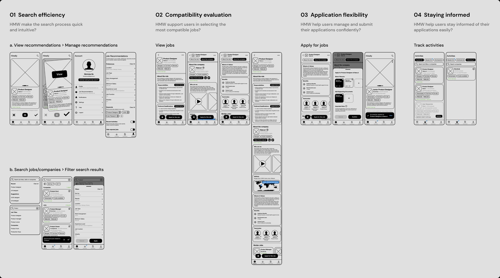
1. View recommendations
2. Search for a job
3. Search for a company
4. Filter job search results
5. View job post
6. Save a job
7. Apply for a job
8. View saved jobs
9. Track applied jobs
User Interviews
While the usability test provided insights to improve Hiredly’s current user experience, it was important to explore beyond the bounds of the mobile app and deepen my understanding of the entire job-search experience in terms of people’s motivations, needs, frustrations and behaviours around the tools they use.
I interviewed 5 Malaysians within Hiredly’s target user base, ranging from fresh graduates to assistant managers, who had all recently landed a new job within the last year. They were made up of users and non-users of Hiredly.

Synthesis
Insights
I made sense of all the data gathered from the usability tests and interviews via affinity mapping. It was a tough but rewarding process putting together common themes that would then help frame the user problems and set a design direction for the rest of the project.
While there were many exciting themes, I ultimately selected 4 that fell within the project scope yet provided enough room to explore ideas that could help me reach the project goals.

Personas
Based on the research findings, I defined 2 personas with very different goals and needs. This would then serve as a simple yet effective reminder of the users that we are designing for.
Design
Ideation & Selection
I entered the ideation phase with the mindset that the outcome would be an evolution of the current design instead of a complete overhaul. That meant building on top of what already works.
The process began with brainstorming potential solutions to the 4 themes, followed by sketches and prioritisation. Having clearly defined issues and goals played a huge role in keeping the process focused. Ideas were combined, separated, and refined until the redesign began to take shape.

Wireframes
After sketching out the best possible iteration within a pre-defined duration, I moved on to creating wireframes and refining the design patterns and elements.
High-fidelity Design
I then translated the wireframes into high-fidelity designs before creating simple interactive test prototypes with basic functionalities for user validation. Here’s a walkthrough of the redesign:
Exploring job recommendations
In the original design, the overall legibility varied greatly depending on the background images, leading to an inconsistent experience from job to job.
To address this, I separated the background image from the written content and rearranged the hierarchy to prioritise visuals at the top, key job information in the middle, and actions at the bottom.
The new layout makes it easier for users to process different forms of information before making a decision.

Searching jobs and companies
To streamline the search experience, I merged job and company search into a single centralised search that users can now access in the new 'Explore' tab. Just type in a job title, company or keyword, and you'll be taken to a search result screen that has also been redesigned to be more responsive and scannable.

Filtering recommendations and search results
Before the redesign, users were confused because search results and job recommendations shared the same filter, and any changes to one would reset the other. Preferences for recommendations are now managed in the 'Account' tab, where they are rarely revisited after onboarding. This allows the search filter to only affect search results.

Viewing a job posting
The redesigned job posting aims to help users quickly evaluate the compatibility of a job through improved navigation, consistent visual elements, and actionable insights. It was important to strike a balance between providing users with useful information and not requiring companies to put in too much time and resources in content creation.

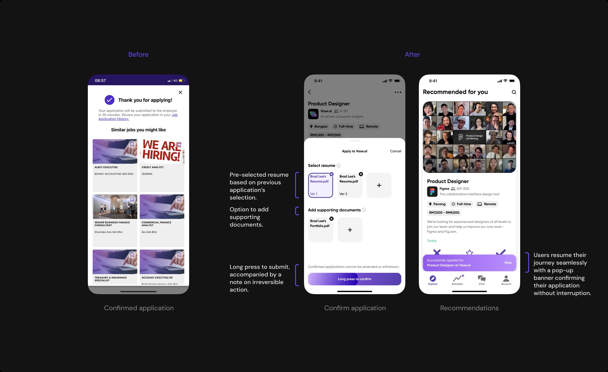
Applying to jobs confidently
Instead of having to wait 30 minutes, the new confirmation sheet allows users to instantly complete a job application. Since submitted applications cannot be withdrawn, I introduced minor friction in the form of a long press button to encourage intentional decision-making. Additionally, users can now upload multiple resumes and documents for tailored job applications.
Keeping track of activities
The 'Saved' tab has been replaced by the 'Activity' tab. Users can now keep track of saved and applied jobs, as well as the companies they follow in a single, easily accessible location.

Validation
Moderated Qualitative User Test
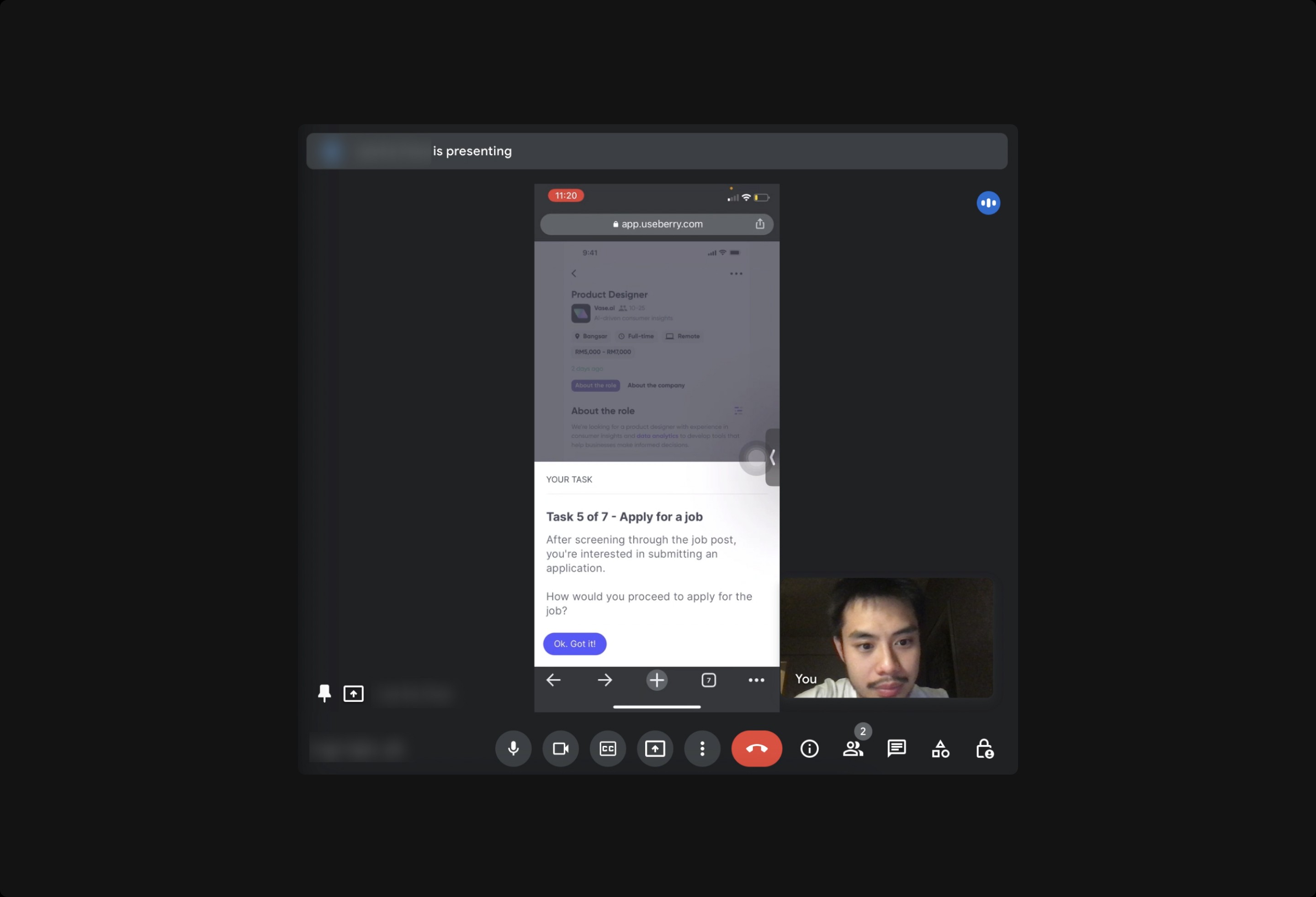
I set up a user test on Useberry in which users were guided by an interactive task-based survey. Users were encouraged to think aloud while I observed and intervened when necessary.
Since I conducted the tests alone, this hybrid arrangement offloaded the moderation process, allowing me to focus more on capturing qualitative insights.
The objectives of the test were:
1. To validate if the redesign addressed the user experience issues in the current design by observing task success and collecting additional feedback.
2. To evaluate if the redesign provided meaningful support to users in pursuing the most compatible opportunities via follow-up questions.
Findings

Design Iteration
Issue 1 - User failed to understand timestamps.
To make it clearer for users, I added past participles to the timestamps. For example, '3 days ago' is now replaced by 'Posted 3 days ago'.

Issue 2 - Users were unsure what the default result filter and sorting option are
I improved the microcopy to clarify how the search results are sorted and filtered by default. Instead of saying "Sort," it now says "Most Recent," and instead of "All Results," it says "Jobs and Companies."

Issue 3 - Users failed to understand symbols
I refined the swiping microcopy to be more descriptive and added tooltips for first-time users. This is done to guide them through their initial experience as they get used to the app.

Issue 4 - Users were unsure what the highlighted texts meant
During user testing, I observed that people didn't know what the highlighted texts in a job description meant. To address this, I added a feature tooltip to properly introduce the new experience and communicate its value to users.

Learnings
Cross-functional Collaboration
The design decisions are skewed as the project was completed entirely on my own. In a realistic project, there are engineering constraints, product roadmaps and other stakeholder needs to consider, particularly when newer and complex technologies are involved.
Continuous Improvement
Product design iteration is never-ending to keep up with evolving user needs. By keeping a manageable scope and handling one set of problems at a time, we make room for future iterations.
Future Steps
Content Guidelines
The job posting screen was redesigned to translate company and job information into meaningful insights for job seekers. In order to provide the intended experience, It’s essential to establish guidelines and work closely with companies to create relevant and compelling content.
Interviews are stressful
During user research, we discovered that interviewing is the most stressful part of job searching due to the lengthy process, many rounds of interviews, and the effort that goes into preparation. Now that we’ve addressed the core functionalities of Hiredly, how might we make the interview process more pleasant for users? Particularly for those with full-time jobs and limited availability.
A consistent experience across platforms
For users who do their final preparation, compilation and resume writing on desktop, how does this app facilitate that transition from mobile? How would we translate the new features over?
Further explore the maps feature
During user testing, this feature seemed to delight many users. Given that commuting is one of the key concerns for many Malaysians, this feature can potentially be expanded to provide more useful information such as traffic trends and transport options.