Overview
Problem
For many freelancers, invoicing tends to be manual and scattered across various tools and locations. On top of that, sending an invoice doesn’t guarantee on-time payments from clients. Leaving this process unoptimised can drain their time and energy, putting unnecessary strain on productivity.
High-level Goals
To make invoicing fast, easy and accessible anytime, anywhere for freelancers.
To ensure a low learning curve for first-time users.
To design the initial experience around a few essential features first.
Solution
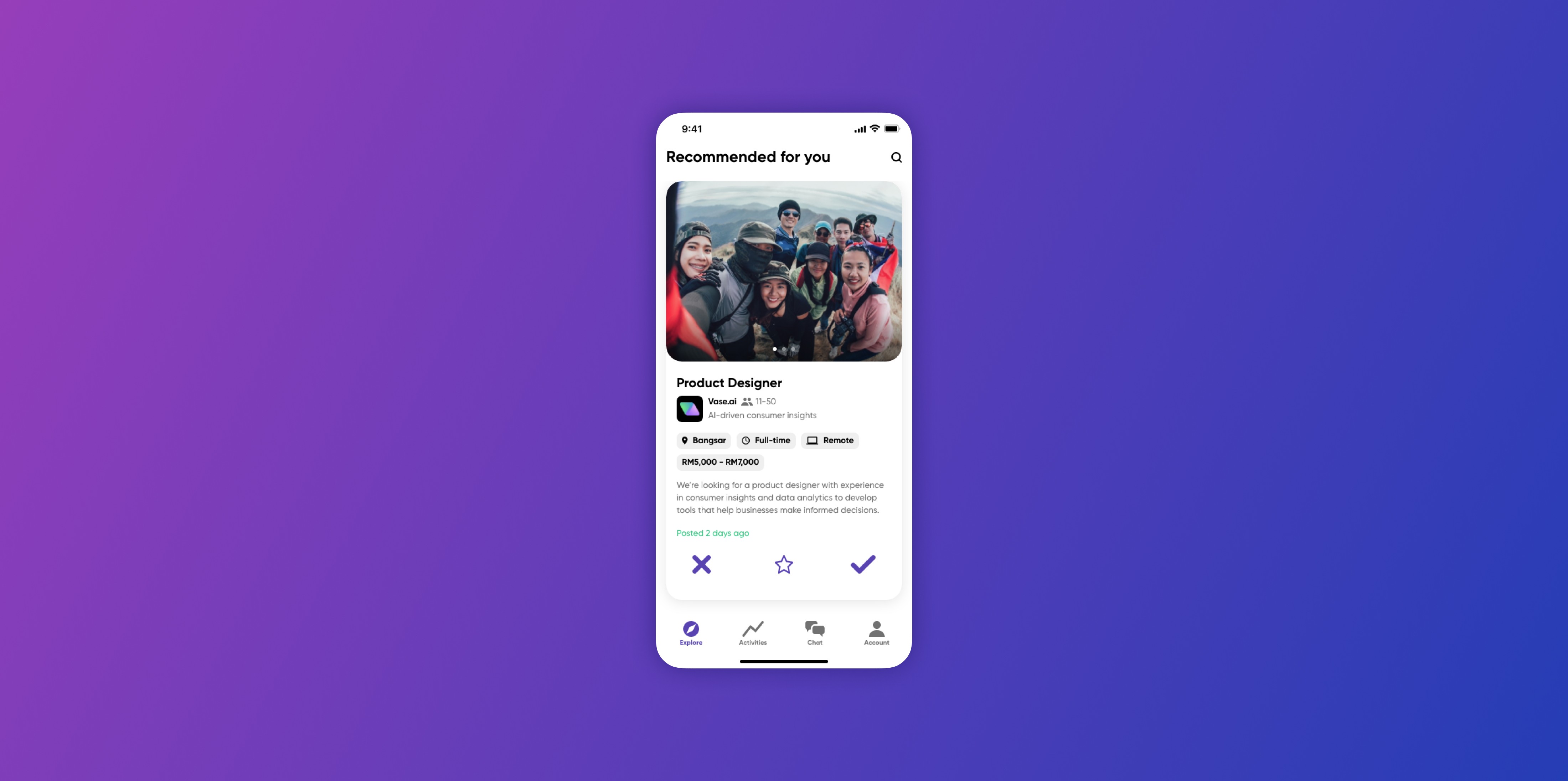
I designed Ease in, a mobile app where freelancers can create an invoice and send it to clients through a link that they can quickly view, sign off on, and pay via various methods. It also provides freelancers with a bird’s eye view of all invoices, allowing them to send timely reminders for late payments.
All invoices at a glance.
Create & send multi-payment invoices.
Get notified when a payment is made or due. Send reminders.
Customers to view, sign and pay invoice via a simple link.
Process
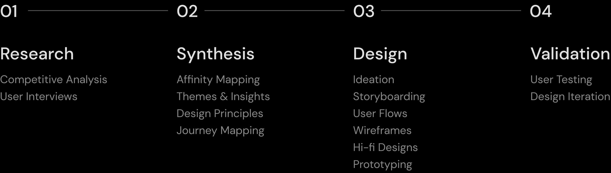
Research
Competitive Analysis
I looked into invoicing products in regional and global markets to identify common and notable features and to understand their strengths and weaknesses. This uncovered areas for potential alignment and differentiation, which I then summarised into the key opportunities below.


User Interviews
Before diving into solutions, it was crucial to speak to freelancers to understand how they manage their invoices and their experience with the current workflows.
I interviewed 5 people, including 3 full-time and part-time freelancers and 2 small business owners who have all been in the field for more than a year. In order to save time, I prefaced the interviews with a short survey to quickly gather background and quantitative information.
As part of the interview, I tested out 2 hypotheses derived from the previous competitive analysis. Interviewees were asked about their thoughts on the potential of a centralised invoicing mobile app and the effectiveness of automated reminders.

Synthesis
Insights
After conducting user interviews, I synthesised all findings via affinity mapping before grouping them into 2 key themes, each with their respective insights.
The process enabled me to make sense of the data gathered and identify the problems to focus on, moving the project forward with more certainty.

Quick Numbers
The pre-interview survey revealed that solo freelancers typically take on 1-3 projects at a time, while small business owners take on 5 or more. On top of that:

Design Princicples

User Journey
To contextualise the current experience, I mapped out the journey of a typical freelancer when working on a project with a new client. It was helpful have this as a visual reference during ideation.

Design
Ideation & Selection

The Solution

Streamlining the invoicing experience
The app brings all invoicing activities into one place, eliminating the need to switch between tools, risking information loss. With a few taps, freelancers can quickly create single or multi-payment invoices and share them with clients.
The app keeps freelancers informed by notifying them when an invoice is signed or paid, and it provides them with an overview of all invoices, allowing them to stay on top of upcoming or late payments and send timely personal reminders.
Encouraging client payment
Invoices are shared via a link. When clients tap into the link, they’re taken to a site where they can seamlessly view, sign and pay the invoice, with PDF files of invoices and receipts available for download when needed.
Embedding a digital signature feature and a payment gateway directly into the invoice site reduces friction in clients’ payment workflow, encouraging them to complete key actions quickly without relying on other apps.
Measuring Success

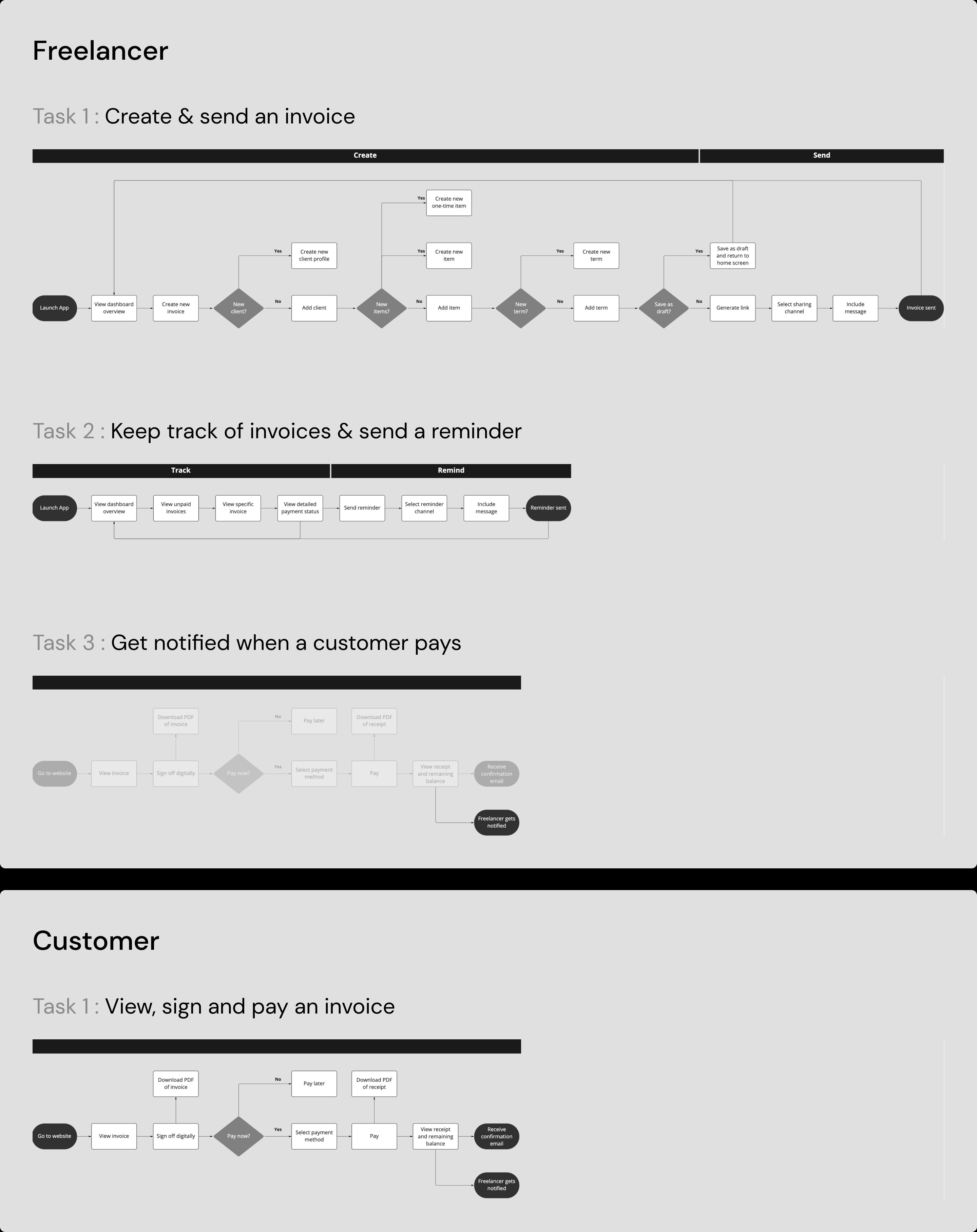
User Flow
With an image of the solution in mind, I mapped out the user flows of the essential tasks through which this product can bring the most value to users.
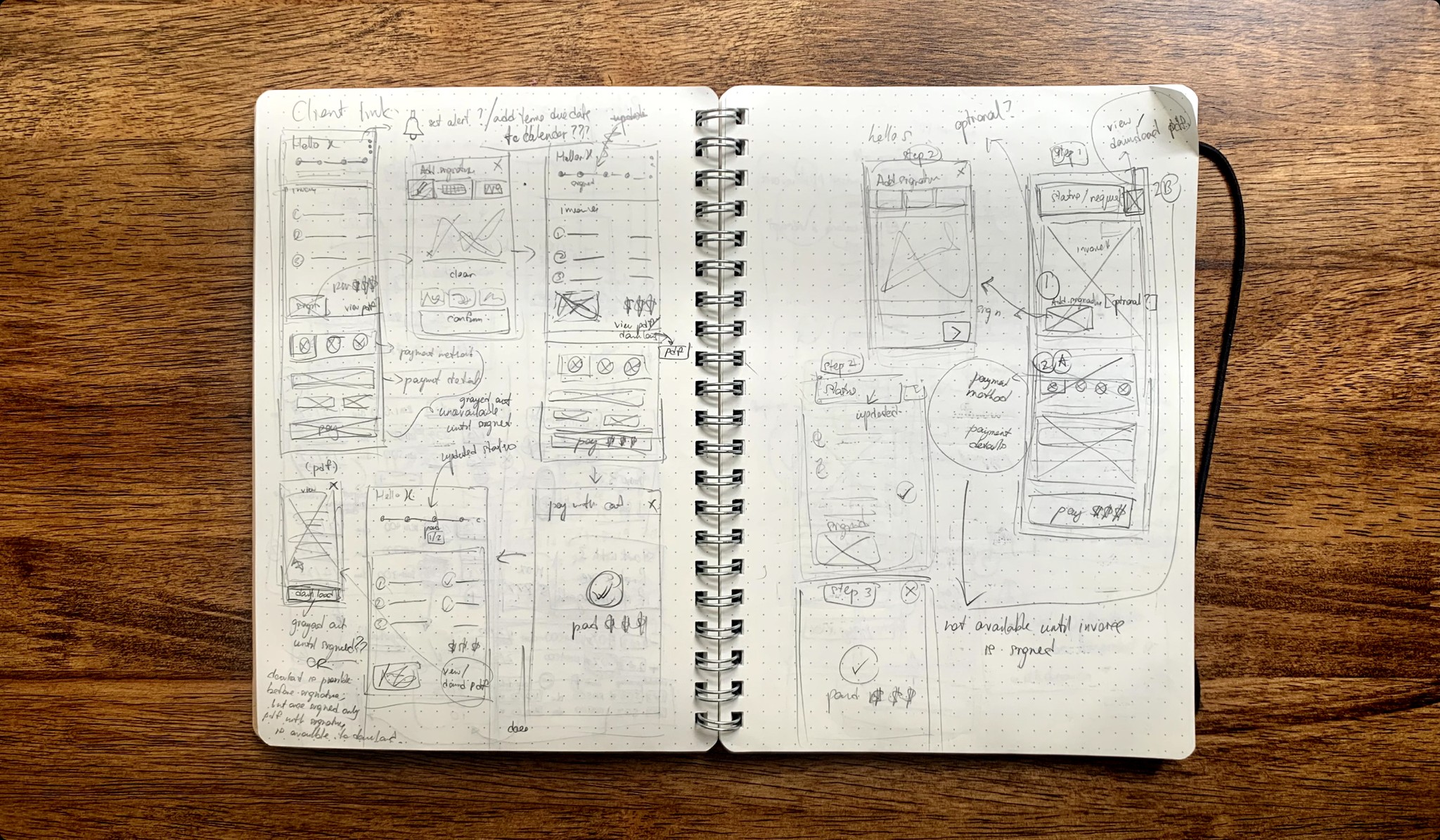
Wireframes
Once the user flows were established, I sketched out low-fidelity wireframes to flesh out the relevant screens for each task. In the process, I explored various ideas with the goal of minimising steps while considering hierarchy, navigation and information architecture.
These ideas were improved and refined before I settled on the best iteration to proceed for high-fidelity design.
High-fidelity Design
Track all payments
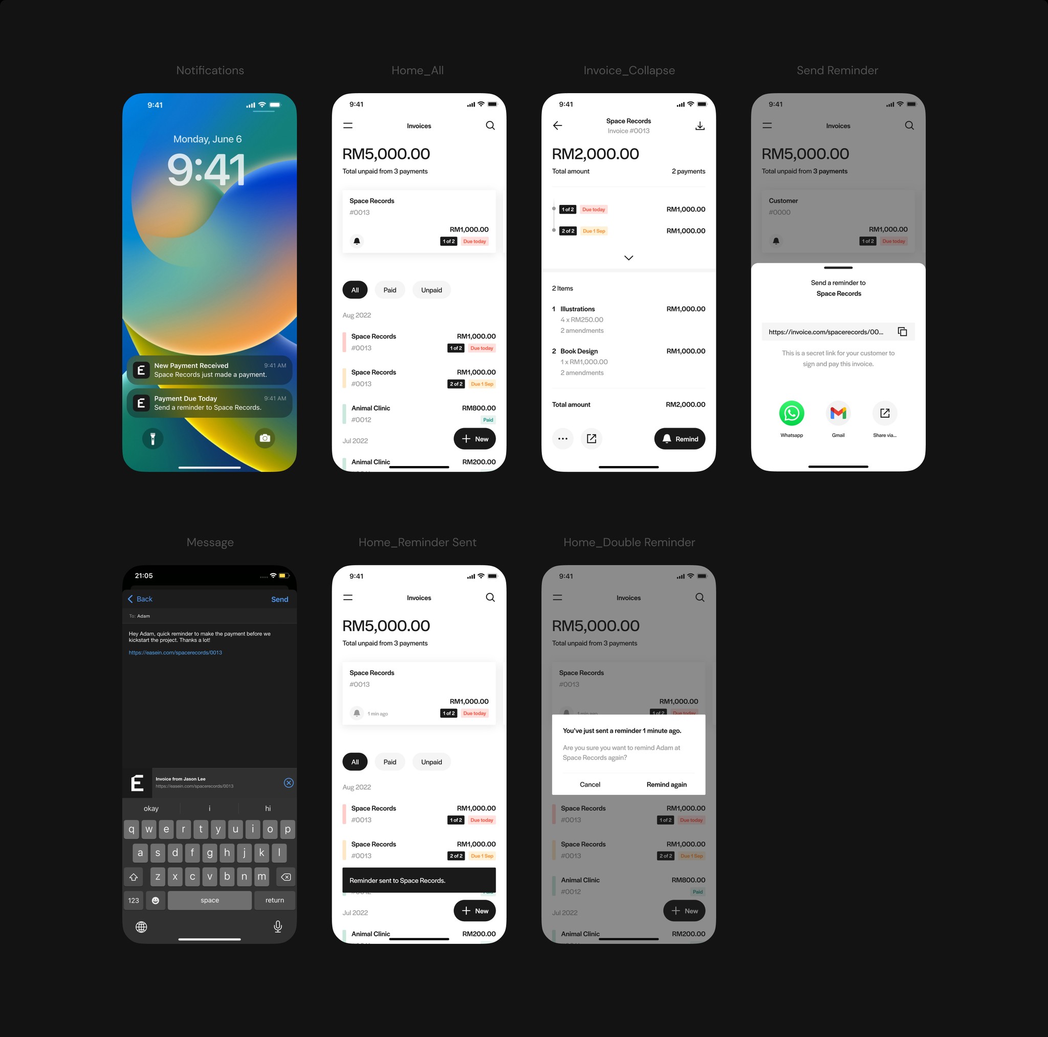
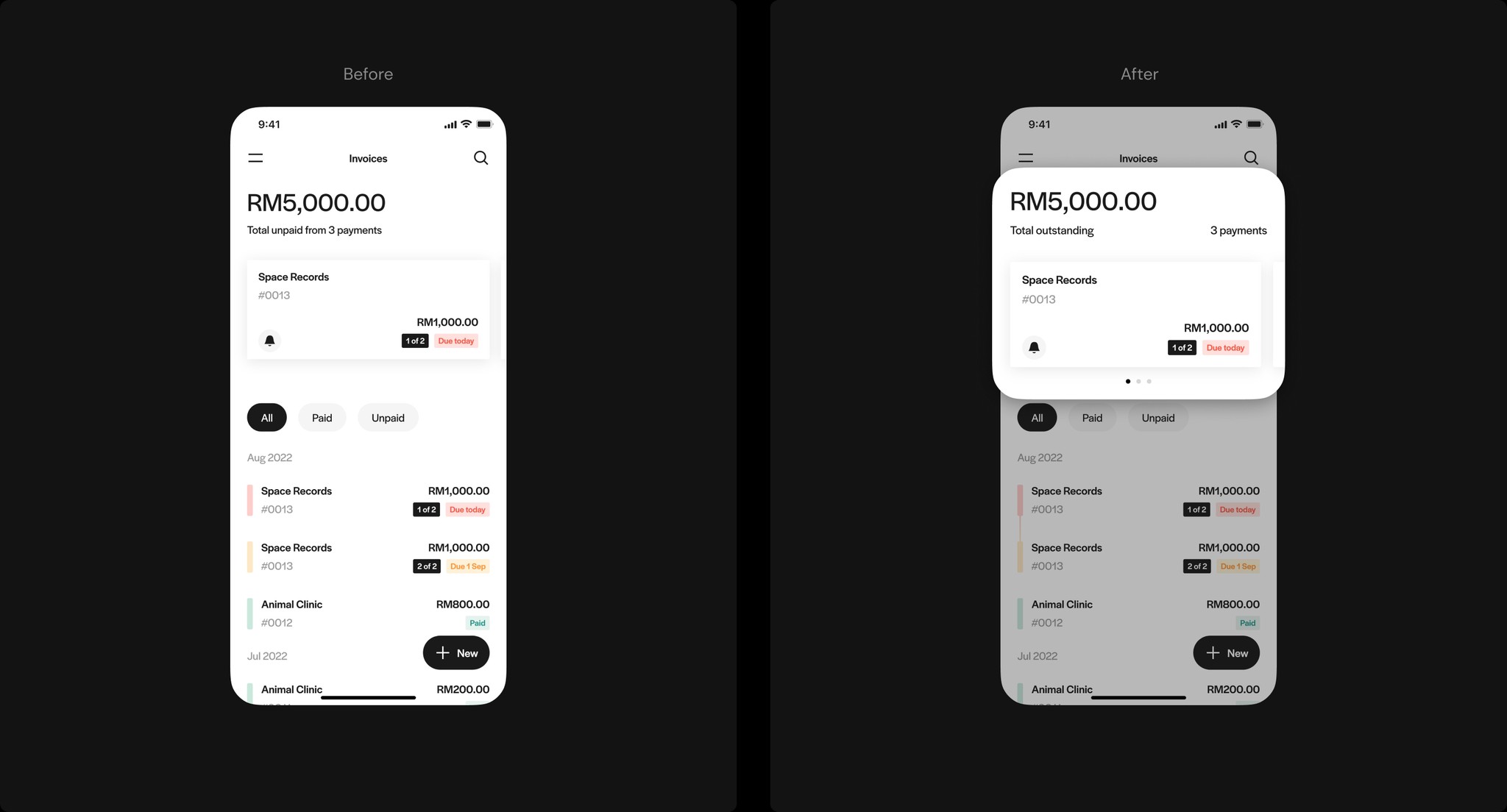
The home screen starts with a summary of all outstanding payments displayed prominently at the top, with individual payment cards providing quick access to reminders and details. The bottom half of the screen contains a list of all invoices, which users can filter by payment status to quickly find the ones they need. Payment status tags are labelled and colour-coded to maximise visibility as users scan through the list.

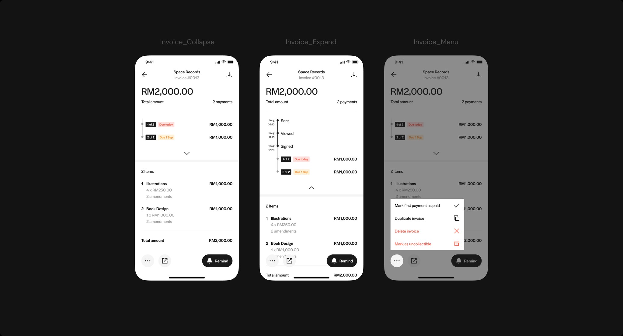
Track a payment
The invoice screen is where users dive into the details of an invoice. By expanding the progress indicator, users can clearly track the status of an invoice, along with date and time stamps. If a payment is made outside of the system, users can easily mark the invoice as paid.
Create & send an invoice
The invoice creation flow follows a predictable hierarchy: Add customers, items, terms, and notes, with signature request as the final step. Users save time by selecting from pre-created lists of customers and products, with recurring items at the top. Default terms and notes can also be set for future invoices.
A final preview screen allows users to review all details for accuracy before sharing the invoice link through any preferred channel.

Send a reminder
Leveraging the effectiveness of personal reminders, I incorporated notifications and clear payment statuses to signal when it's a good time to remind a customer, for a more informed experience. To facilitate the action, I included entry points accessible directly from notifications, the home screen, and the invoice screen.
View, sign & pay an invoice
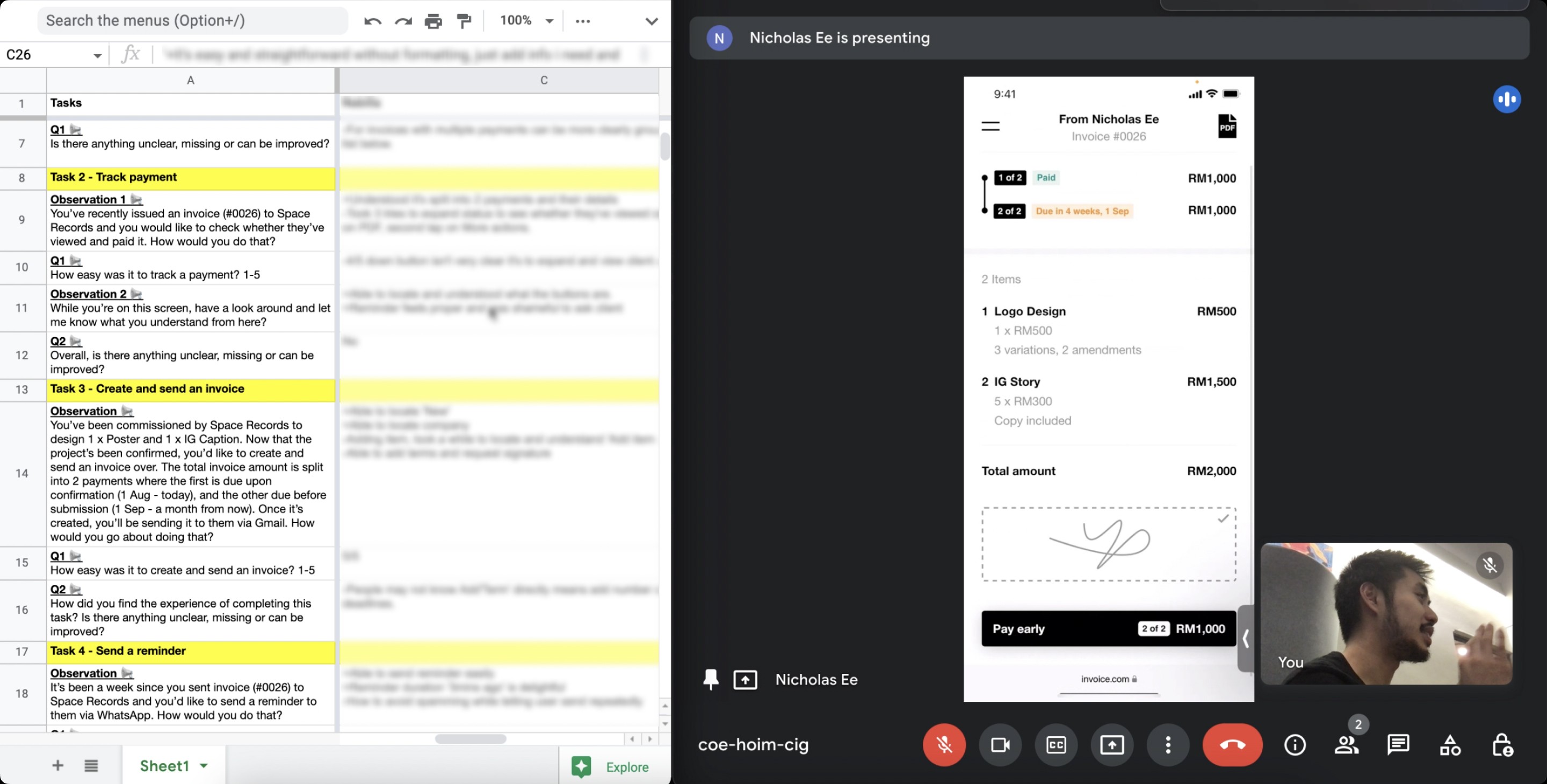
The customer's payment experience is centered around flexibility, with multiple options to sign and pay, encouraging quick action. For multi-payment invoices, I added details to the payment button to ensure clarity on the specific transaction being made before confirmation.

Validation
Moderated Qualitative Usability Test
Aligning with the project goals, the objectives of the test were:
1. To observe potential learnability and usability issues when completing key tasks.
2. To gauge user interest and gather feedback on how well the product solves their current frustrations.
I conducted the test with the same 5 users who participated in the initial research. The test included 5 key tasks, each paired with its dedicated test prototype that only allowed specific actions to keep users on track.
Following each task, users were asked follow-up questions to clarify their experience.

Findings
Addressing Feedback
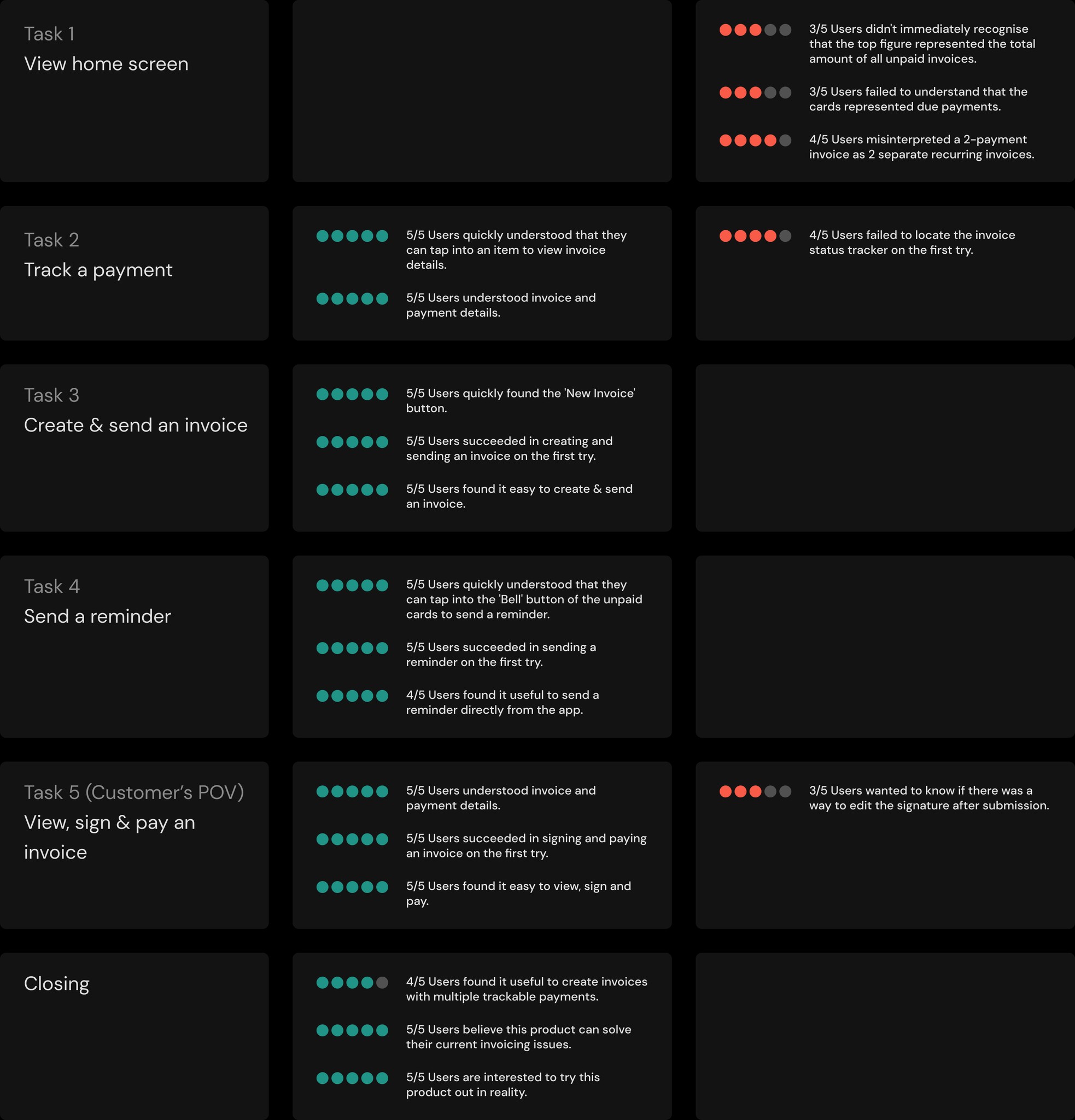
Issue 1 - Users needed time to understand what the top figure represented
To improve clarity, I replaced the lengthy subtitle with "total outstanding" and moved the number of payments the side. Breaking down the information could help improve user understanding. I made it clear that cards are scrollable and part of a carousel by revealing more of the subsequent card and adding pagination reflecting the number of outstanding payments.
Issue 2 - Users misinterpreted a 2-payment invoice as 2 separate invoices
Users were confused when they saw repeated items with the same invoice number in the list and didn't realize that they were actually two payments for the same invoice. To fix this, I added a visual thread that signifies the connection between the two payments.

Issue 3 - Users failed to locate the invoice status tracker on the first try
When trying to view invoice activities, users often tapped the 'menu' button instead of the ‘expand’ button, only realising their mistake after a few attempts. Although they noticed the button, many were unsure of its function because they were unfamiliar with a UI pattern that combined activities and payment terms. To address this issue, we could add a tooltip or a label to educate users on the button’s function.

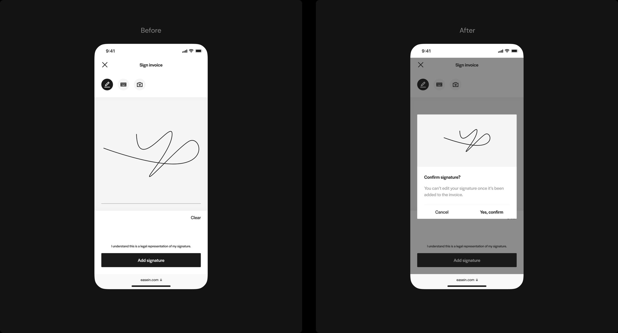
Issue 4 - Users wanted to know if the signature is editable after submission
Some users were curious if they could adjust their submitted signature in case of an error. However, to maintain accountability, submitted signatures cannot be modified or removed. To avoid any confusion, a confirmation dialog could be implemented, clearly stating that the process is irreversible.
Design System
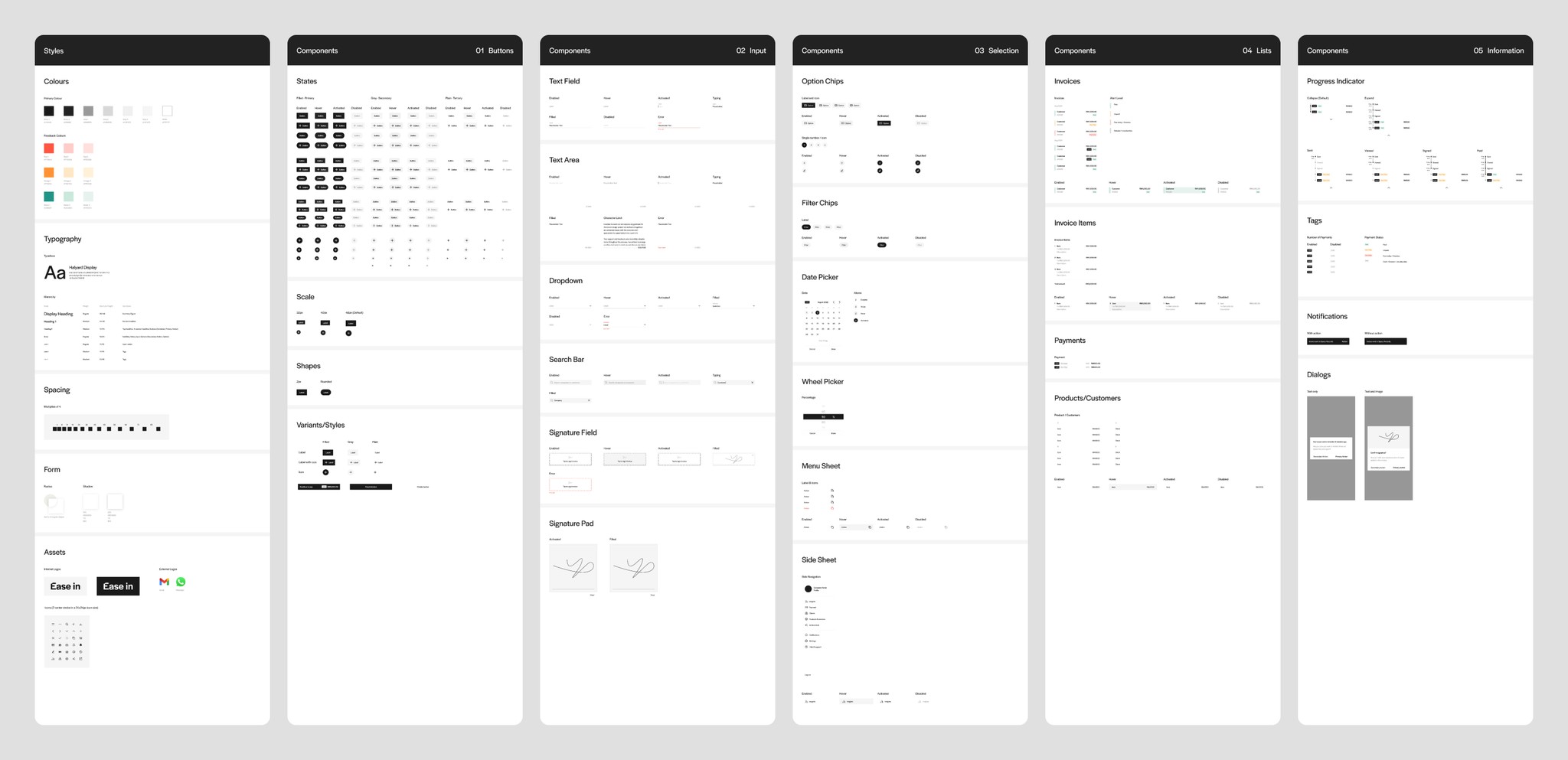
I developed a style guide and a component library to ensure that the interface design is consistent throughout the platform for improved learnability and brand recognition. With scalability in mind, I turned repetitive elements into reusable components to speed up future design and development.

Learnings
Domain Research
Most of the project's domain research was conducted online. In hindsight, it's clear that I missed an opportunity to improve the design outcome by talking to professionals in accounting and finance to clarify domain-specific information, such as feasibility of multi-payment invoices and other legal requirements.
Reinvention may not be necessary
Direct communication is highly valued in an industry that relies heavily on networking and referrals. Reminders are found to be effective in ensuring clients pay on time, especially when done personally. Unless we develop an entirely new way to encourage client payments, it may be more productive to streamline and optimise the reminder process.
Involving users as early as possible
If I could do one thing differently, I would invite end users to join our brainstorm session to understand their point of view on certain ideas in real time. This could potentially speed up the idea prioritisation process and help us reach a user-centric solution quickly.
Future Steps
Security Concerns
Based on the proposed product concept, the shareable link leads right to the invoice without security barriers. If the link is accidentally shared with the wrong recipients, confidential project information can get leaked. How might we address this security concern?
Refining the experience for recurring clients
Due to time constraints, I excluded the ‘Past Projects’ feature, where regular clients can track invoices and payments of all past projects with a particular freelancer via the same link.
This idea came up when I found out how common it is to work with recurring clients and how it can potentially be frustrating for clients to track a new link each time there’s a new invoice. If time permits, I’d love to validate how helpful this idea is and explore its design.
Market Validation
The current design consists of core features most valuable to users. With items 1 and 2 above considered, the next step would be to develop an MVP to collect quantitative insights to help us better understand Ease in's product-market fit.